Web Typography: Essential Guide for Your Digital Brand
Typography defines your digital brand's tone. Learn to pair fonts, optimize readability, and improve your site's performance.
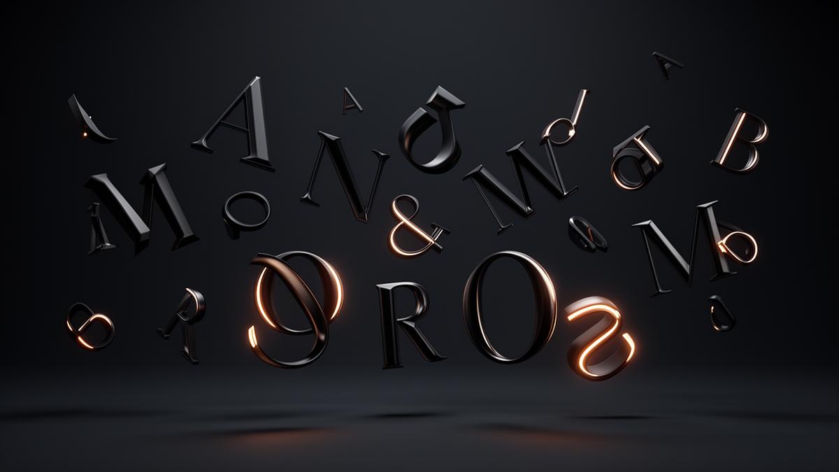
Typography is the visual voice of your brand. A well-chosen font communicates professionalism, personality, and trust before the user reads a single word. Yet most websites make typographic mistakes that cost money through lower readability, worse SEO, and higher bounce rates.
95% of information on the web is written language. Optimizing typography is optimizing nearly everything — Oliver Reichenstein, iA.
The Two-Font Rule
The golden rule is to combine a maximum of two fonts: one for headings (display) and one for body text. Look for contrast:
- Serif + Sans-serif: the classic combo — Playfair Display for headings + Inter for body
- Sans-serif + Sans-serif: modern and clean — Space Grotesk for headings + DM Sans for body
- Display + Neutral: maximum impact — Clash Display for headlines + General Sans for text
Avoid combining fonts that are too similar (two sans-serifs with the same personality) or too different (a decorative script with a traditional serif). Tension should be interesting, not chaotic.
Readability: Non-Negotiable
Readability is non-negotiable. Proven standards that improve reading comprehension:
- Minimum 16px for body text (18px on mobile)
- Line height of 1.5-1.75 of font size
- Line length between 50-75 characters (45-65 on mobile)
- Minimum contrast 4.5:1 between text and background
- Avoid justified text on screen: it creates irregular rivers of whitespace
A 20% improvement in readability can increase time-on-page by 25% — Nielsen Norman Group.
Variable Fonts: The Future is Now
Variable fonts are a typographic revolution. A single font file contains all weights (thin, regular, bold, black) and styles (condensed, expanded), drastically reducing the number of files the browser needs to download.
- Weight reduction: one variable font replaces 4-8 static files, saving 100-400KB
- Creative flexibility: you can use intermediate weights (450, 550) for unique typographic nuances
- Typographic animations: you can animate font weight or width with CSS transitions
- Recommended examples: Inter Variable, DM Sans Variable, Plus Jakarta Sans Variable
To implement them, use @font-face with the font-weight descriptor as a range (100 900) and the woff2-variations format.
System Font Stacks: Maximum Performance
If performance is your top priority, system font stacks eliminate font downloads entirely. The browser uses fonts already installed on the user's device:
- Apple: San Francisco (SF Pro) — elegant and readable
- Windows: Segoe UI — professional and clear
- Android: Roboto — versatile and modern
Recommended stack: font-family: system-ui, -apple-system, BlinkMacSystemFont, "Segoe UI", Roboto, sans-serif. Zero additional KBs and a native experience on every platform.
Typographic Performance: Every KB Counts
Every font you load adds 20-100KB to your site. Strategies to optimize:
- Use WOFF2: up to 30% lighter than WOFF, supported by all modern browsers
- Limit weights: regular (400) and bold (700) suffice for 90% of cases
- Implement font-display: swap: shows text with system font while custom loads
- Preload critical fonts: <link rel="preload" as="font" type="font/woff2"> for the heading font
- Subsetting: generate versions containing only the characters you use (latin, latin-extended)
Visual Hierarchy: Guide the User
Visual hierarchy through typography guides users through your content:
- H1 (32-48px): Main headings — bold, with display font
- H2 (24-32px): Section subtitles — contextualize and separate
- H3 (20-24px): Sub-subsections — organize detail
- Body (16-18px): Main text — the backbone of reading
- Small (14px): Auxiliary text — metadata, timestamps, captions
Use weight, size, and color to create at least 3 clear levels. A common mistake is hierarchy levels that aren't distinct enough: if H2 and H3 look too similar, users lose the structure.
Case Studies: Brands That Do It Right
Brands with exceptional typography to use as reference:
- Apple: San Francisco — absolute clarity, perfect hierarchy, generous spacing
- Stripe: custom display font paired with Söhne for body — technical elegance
- Linear: Inter with carefully selected weights — functional minimalism
- Airbnb: Cereal — warmth and accessibility with unique personality
Conclusion
Typography isn't just choosing a pretty font: it's a complete system that affects readability, performance, accessibility, and brand identity. Invest time defining your typographic system and keep it consistent across all touchpoints. Good typography is invisible — the user simply enjoys reading without knowing why.
Errores tipográficos que vemos constantemente en webs de Barcelona
En proyectos de diseño web trabajamos con negocios de todo tipo y los fallos se repiten: restaurantes que usan una fuente script para todo el menú online, ilegible en móvil; clínicas que ponen el cuerpo de texto en gris claro sobre blanco por parecer "elegante", sacrificando contraste y accesibilidad; tiendas que cargan cinco pesos de una fuente decorativa que apenas se usa dos veces en toda la página. Ninguno de estos errores se nota en el diseño estático que se enseña en una reunión: se nota cuando el usuario real intenta leer desde la calle, con el móvil en una mano y sol de mediodía en la pantalla.
Cómo elegir tipografía según el tipo de negocio
No toda marca necesita la misma personalidad tipográfica. Algunas referencias prácticas:
- Restaurantes y hostelería: una serif con carácter para el nombre y los títulos de sección transmite tradición; el cuerpo del menú debe ir siempre en una sans-serif muy legible, porque se lee con luz cambiante y poca paciencia.
- Clínicas y consultas: prioriza claridad y calma. Sans-serif neutra, contraste alto, nada de tipografías con trazos finos que se pierdan en pantallas pequeñas.
- Tiendas online y marcas jóvenes: aquí hay más margen para fuentes display con personalidad en titulares, siempre que el cuerpo de producto y precio use una fuente sobria y muy legible.
- Despachos profesionales (abogacía, consultoría): una serif clásica o una sans-serif geométrica bien espaciada refuerza la sensación de solidez sin resultar fría.
Preguntas que nos hacen los clientes sobre tipografía
¿Puedo usar la fuente de mi logo en toda la web? Casi nunca es buena idea si es una fuente decorativa: resérvala para el logo y algún titular puntual, y usa una fuente funcional para el resto.
¿Afecta la tipografía al SEO? De forma indirecta sí: una tipografía mal optimizada añade peso de carga, y la velocidad de carga es un factor de posicionamiento. Elegir bien la fuente y limitar los pesos cargados mejora tanto la lectura como el rendimiento técnico.
¿Merece la pena pagar por una fuente premium? Solo si tu marca depende mucho de la diferenciación visual (moda, diseño, hostelería de alto nivel). Para la mayoría de pymes de Barcelona, las fuentes variables gratuitas de Google Fonts bien combinadas dan un resultado profesional sin coste añadido.
Frequently asked questions
How many fonts should I use on my website?
It's recommended to use a maximum of 2-3 fonts: one for headings (display), one for body text (body), and optionally one for accents. More fonts slow down loading and create visual noise.
What font size is ideal for web text?
The recommended minimum is 16px for body text on desktop and 14-16px on mobile. For headings, a modular scale (1.25 or 1.333) ensures consistent visual hierarchy.
Is Google Fonts the best option for web typography?
Google Fonts is free and easy to implement, but self-hosting fonts is faster because it eliminates the DNS request to Google. Use WOFF2 formats for maximum compression.
How does typography affect my website's SEO?
Typography indirectly affects SEO through Core Web Vital CLS (Cumulative Layout Shift). Using font-display: swap and preloading critical fonts improves both user experience and ranking.